


Dutch Masters
Overview

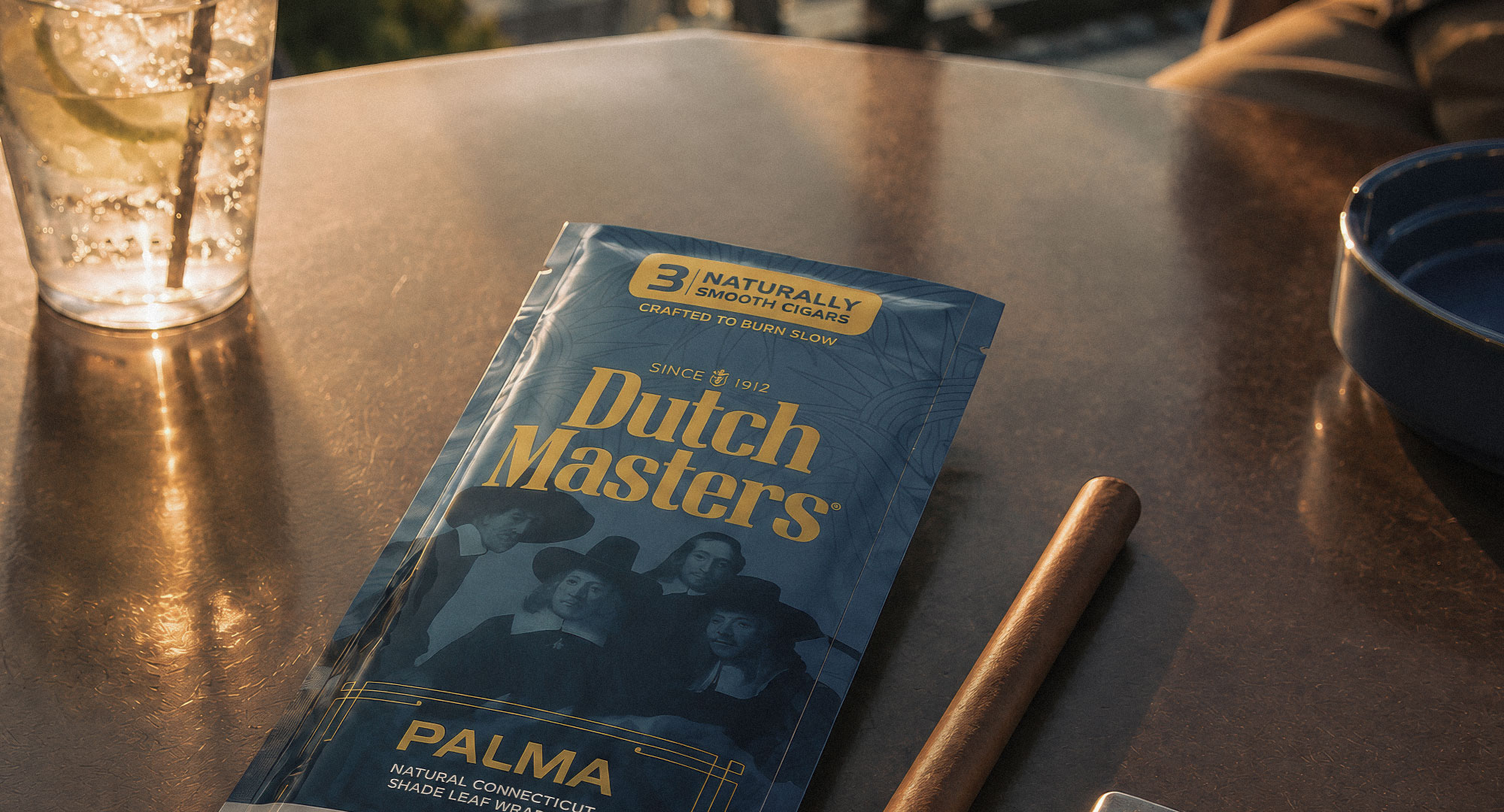
Dutch Masters is a long-standing cigar brand with a visual identity rooted in classical portraiture, heritage, and traditional craft cues. Its packaging language has historically leaned on dark tones, ornate framing, and gold accents, creating a sense of familiarity, legacy, and classic tobacco culture.
The visual direction focused on creating a stronger packaging system
across classic and flavored cigar products. The work explored how the brand's historic
identity, portrait-based heritage, gold detailing, and modern flavor segmentation could
live together in a cleaner, more focused packaging language.
Pattern System
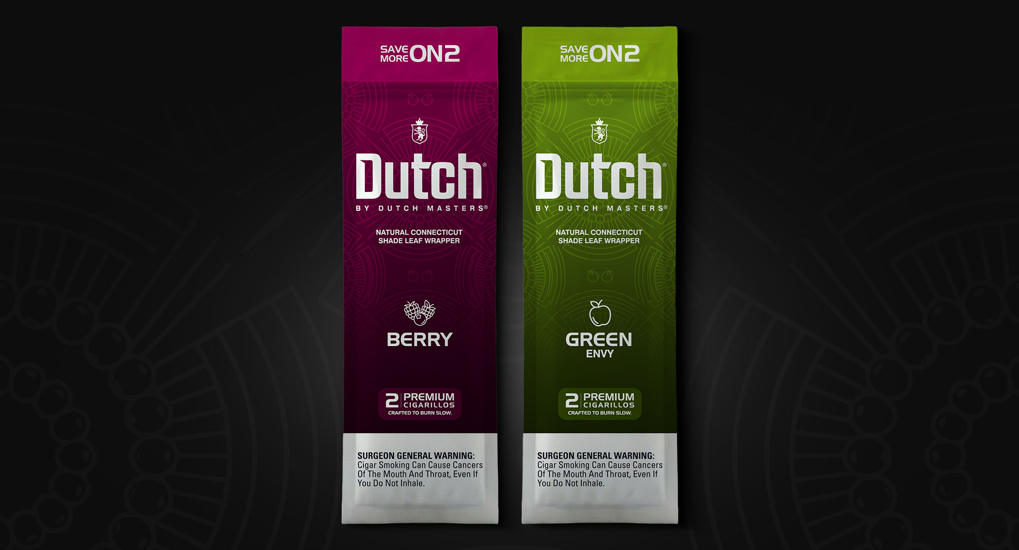
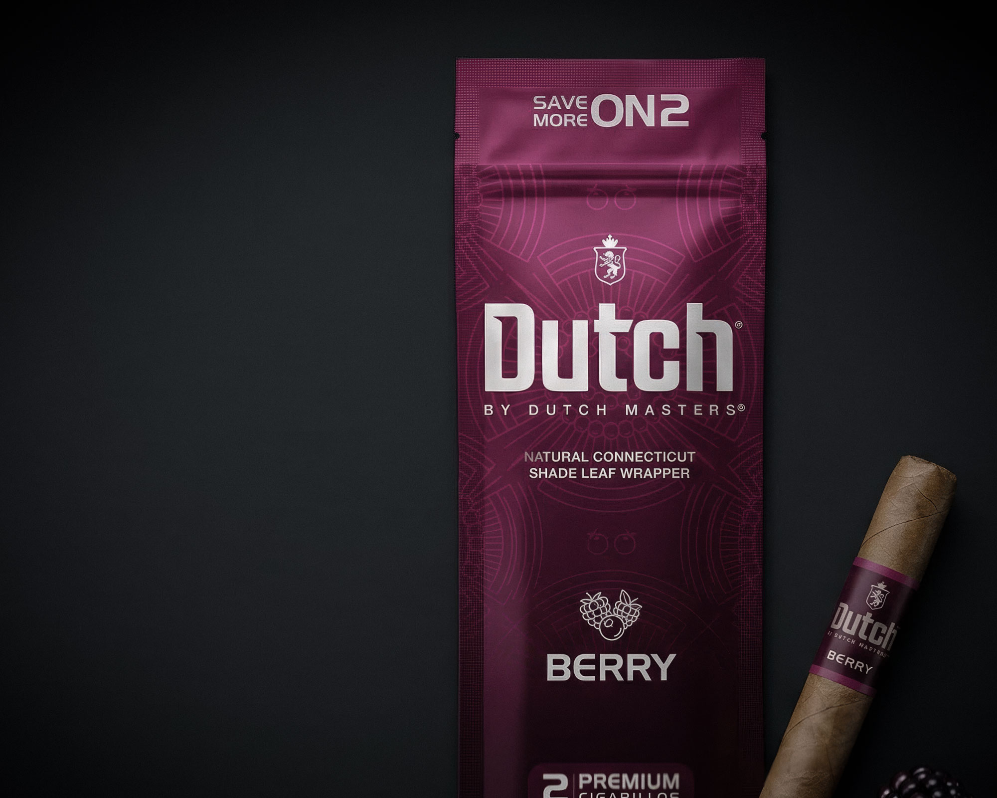
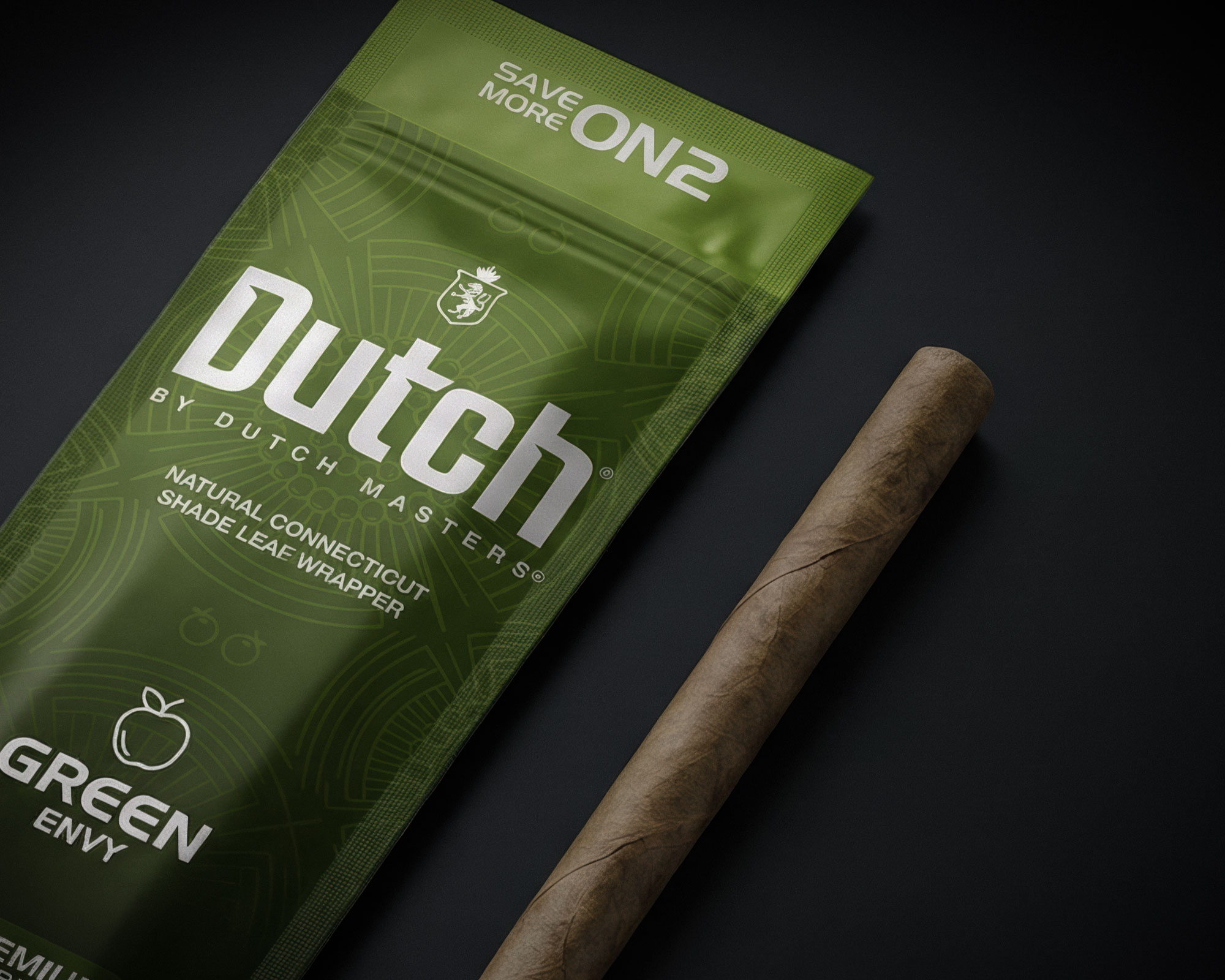
Custom line patterns were used to create continuity between variants while allowing each product line to keep its own tone, more classic and ornamental for Legacy, more graphic and energetic for Aromas.


Flavor Architecture
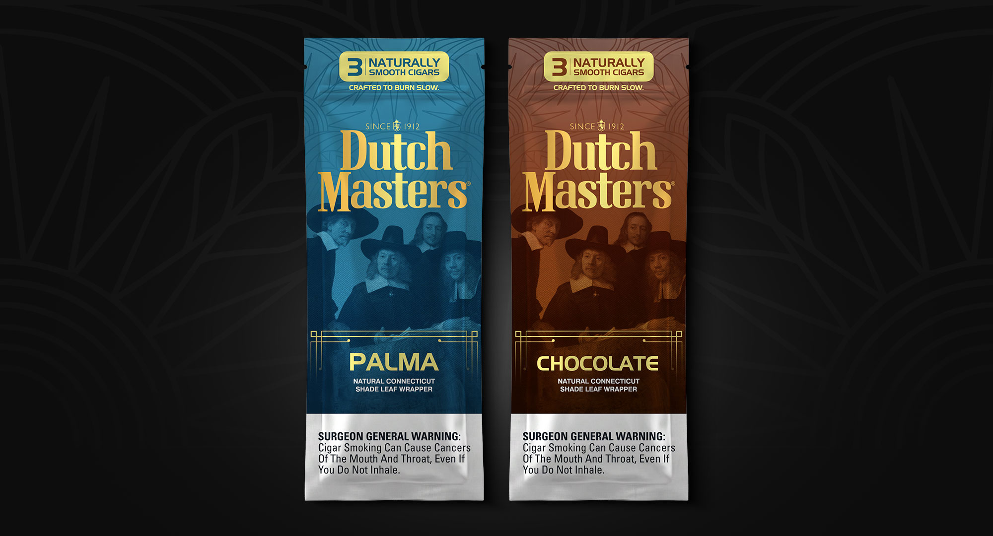
Each variant was assigned a distinct color world to improve recognition while preserving a shared structure across the range. The goal was to make every flavor feel individual without breaking the family.




Packaging Range
The range separates heritage-led variants from aroma-led products while keeping a shared visual structure across the full packaging family.

Outcome
A refreshed packaging system that brings the portfolio into a cleaner, more unified visual language. The direction balances heritage cues, stronger flavor navigation, and a more modern shelf presence across both classic and flavored product lines.