

Ice Noir Cafe
Overview

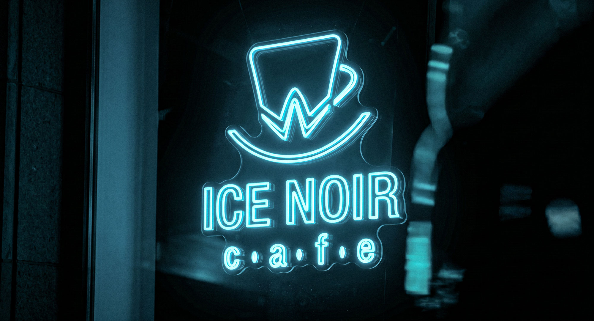
Ice Noir is a local family-run cafe built around good coffee, familiar rituals, and quiet personal taste.
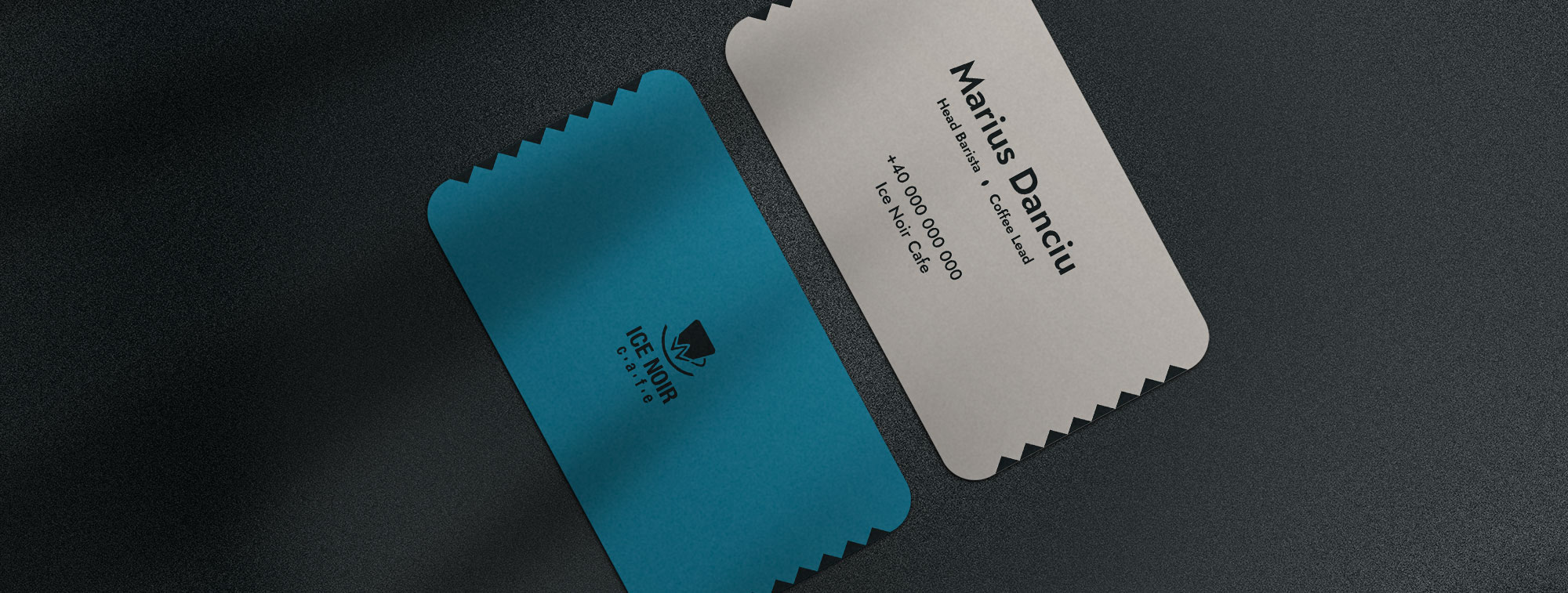
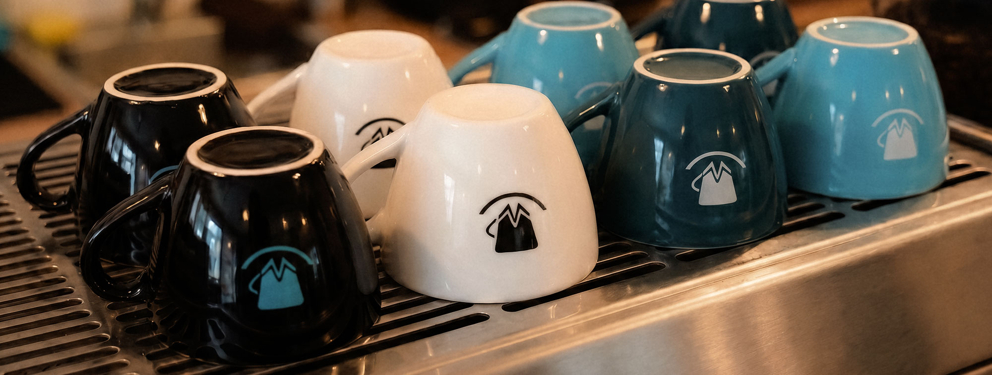
The identity started with a logo, then expanded into menus, posters, flyers, packaging details, and small branded moments inside the bar.
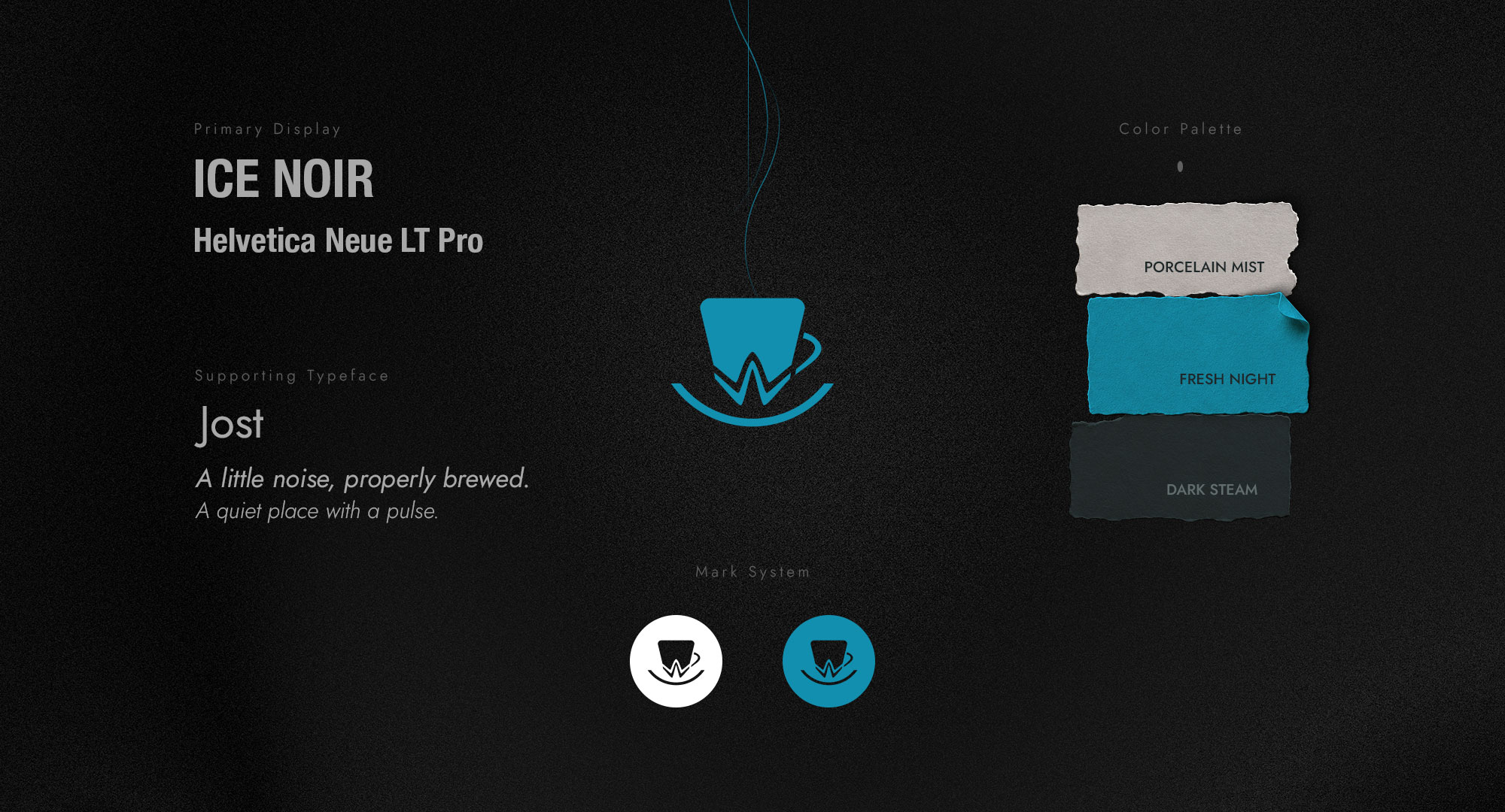
The direction balances a bright, recognizable mark with cool cafe tones, clean typography, and subtle symbolic details, inspired by heritage, quality products, and the owner's understated sense of style.
The result is a small brand system that feels personal rather than commercial, refined without becoming cold.
Print & Packaging
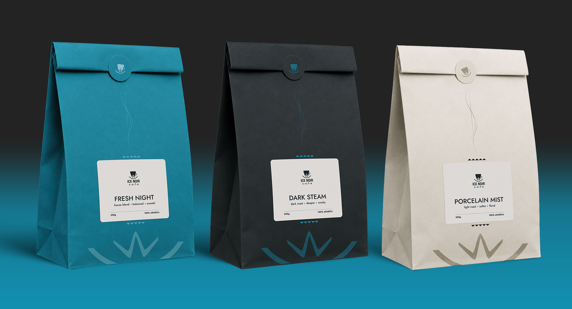
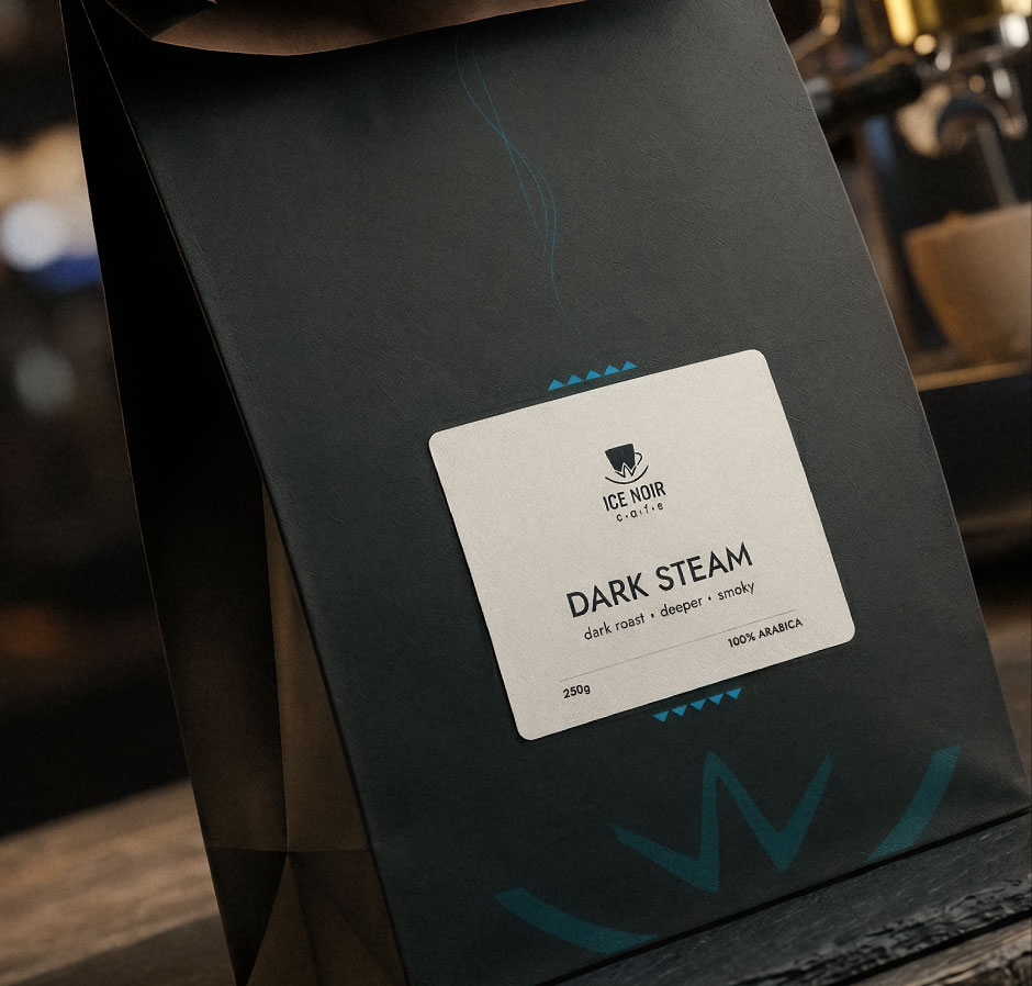
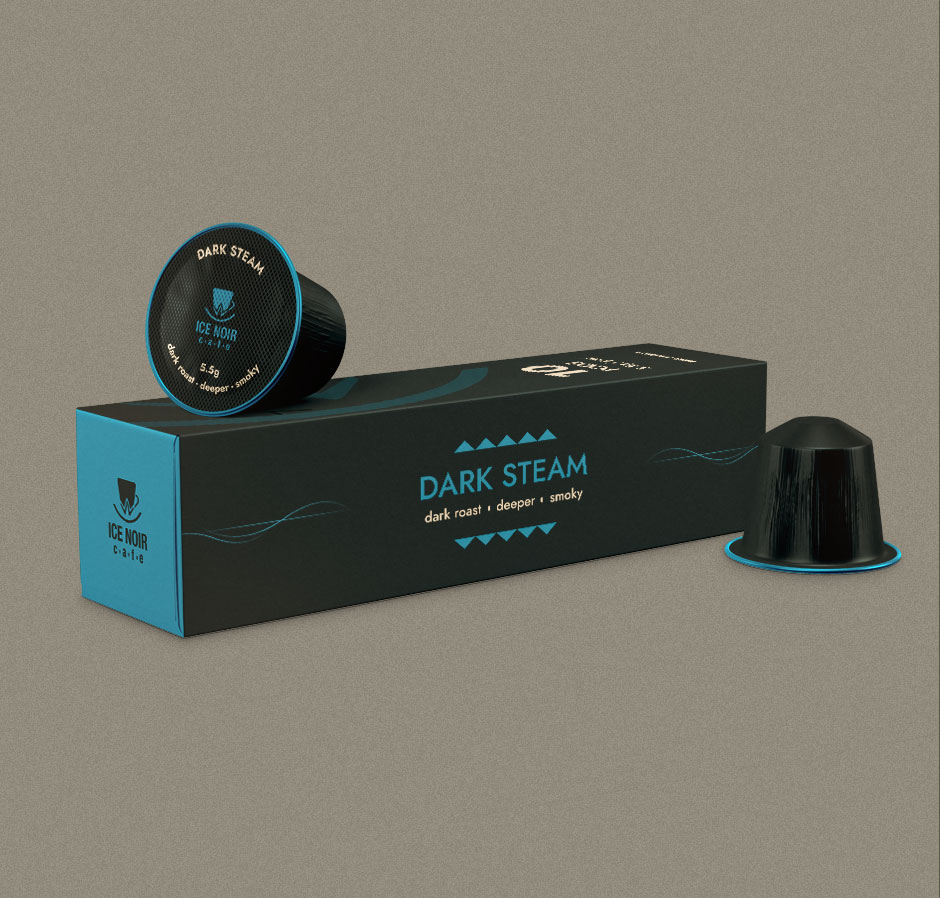
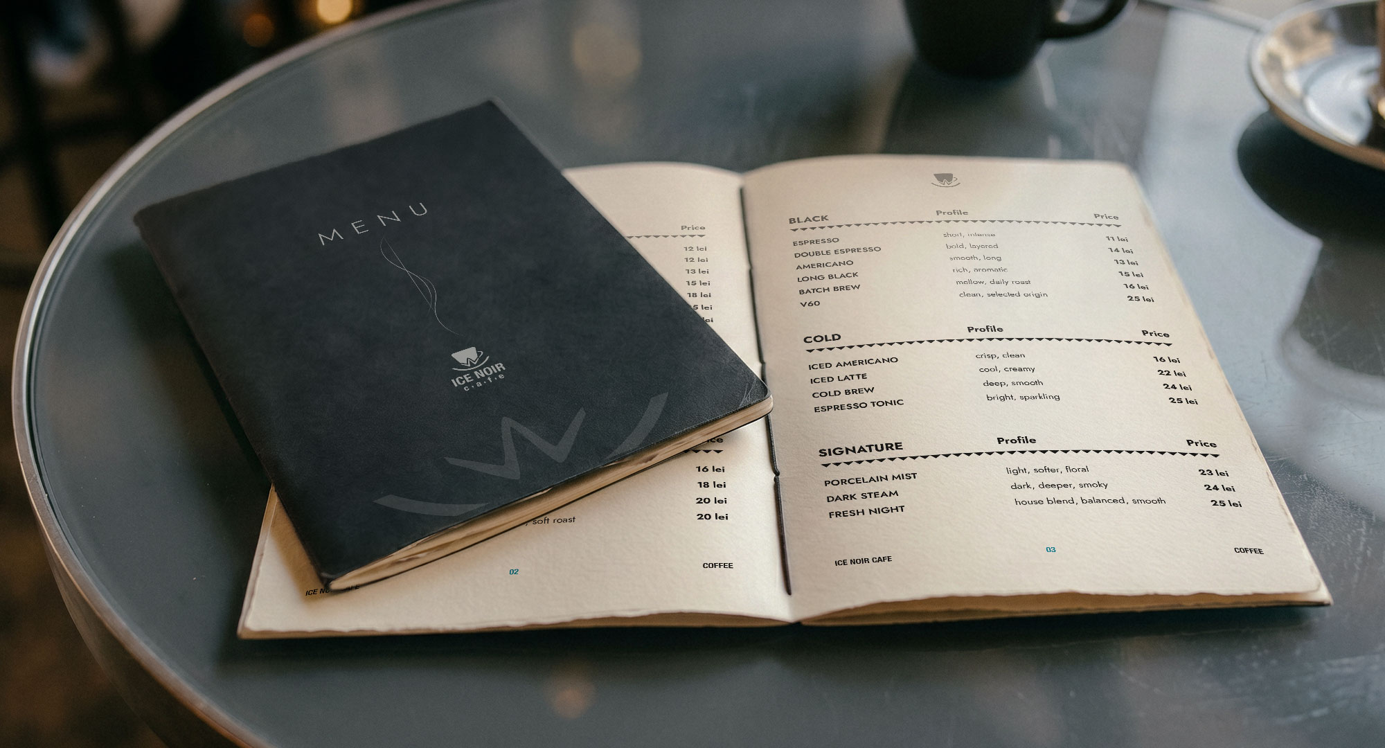
A compact print system was developed to extend the identity into physical touchpoints, from coffee bags and capsule boxes to stickers, labels, and menu materials. The goal was to keep everything tactile and functional, while preserving the brand's cool, atmospheric character across both light and dark materials.
Social Media
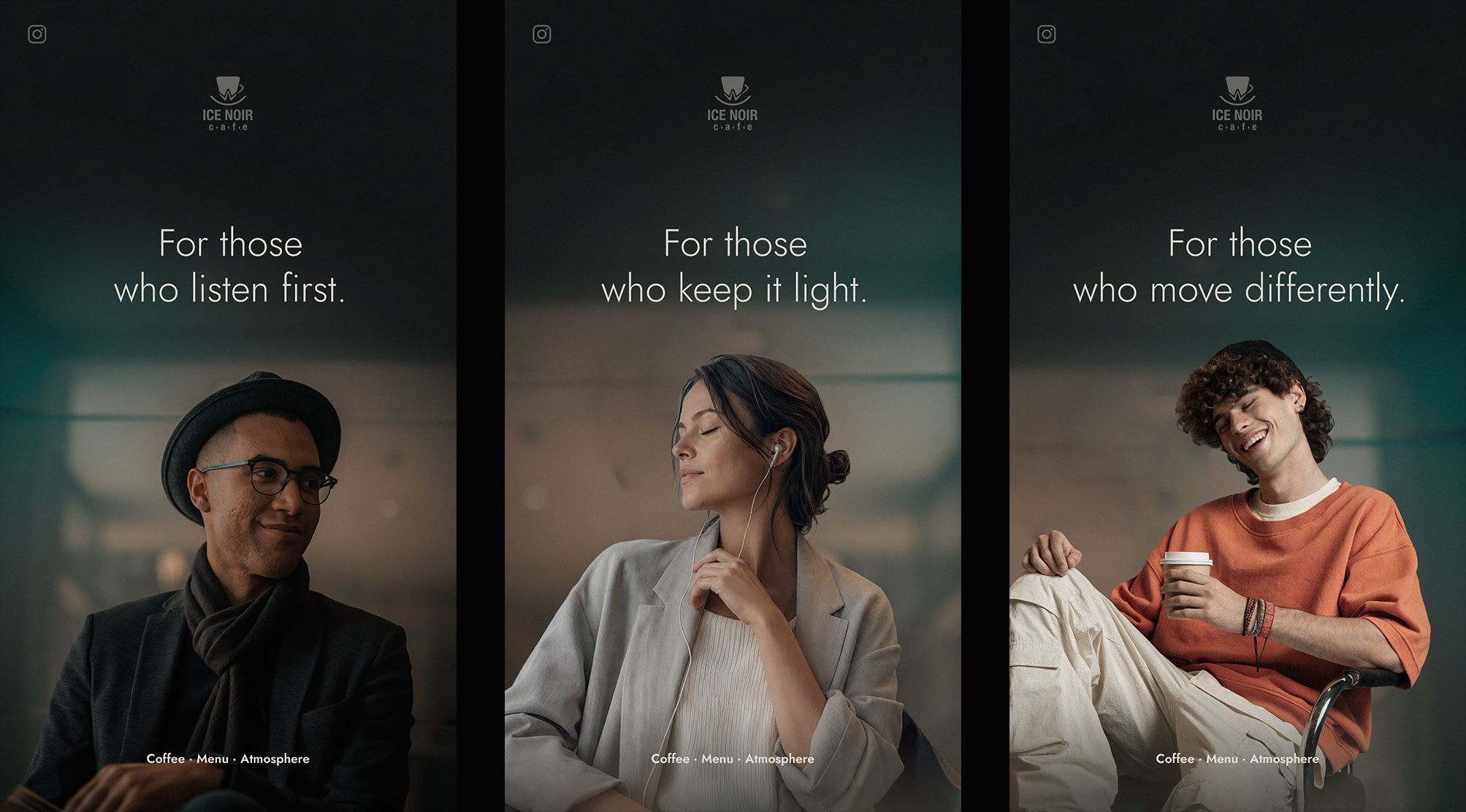
The social direction was built around quiet cafe moments, soft portraits, and short statement-led compositions. Instead of loud promotional graphics, the visuals focus on mood, intimacy, and the kind of people the brand wants to speak to.
Outcome
Ice Noir became a compact but expressive identity system, one that can move from signage and packaging to cafe objects and digital communication without losing its atmosphere. The result feels premium, quiet, and slightly cinematic, built for a local cafe with a clear visual character.